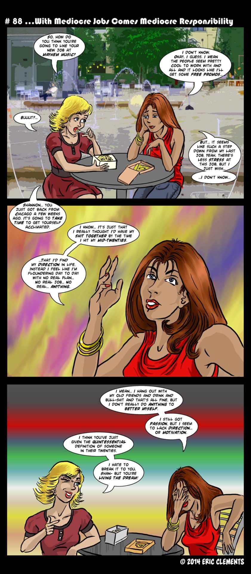
Some days I have more time to devote to drawing the background than others. This was not one of those days.
I'm still trying to clarify my drawing style. I know it's a bit different than a lot of other web comics out there. For instance, I use the program Coral Painter instead of Photoshop (with the exception of the lettering), and tend to paint the colors directly onto one layer and drop the inked layer on top of it. -something I think hardly anyone else does. Also my characters and drawing in general does not adhere to a very comic-like slash anime look. There are some amazing web comics out there that utilize that style with stunning results. I, on the other hand, want to do something different. And although I like the direction Bohemian Nights is going, I think I need to push myself a little further and see where my own drawing style will take me. In the weeks to come, probably sometime after the 100th post (since I generally try to maintain a ten comic lead over what gets published), I will be experimenting with the style and look of the art from time to time, trying to fine tune the exact look I am hoping for.
In short, as any creator does, I hope what I bring to the table is well received and enjoyed. Hopefully those of you who find your way to this tiny website week-in and week-out do so because you've discovered something you enjoy reading, if only for a few moments of your day. It's for all of you that I do this labor of love for.
Oh, and then there's this...
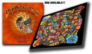
Drinker's Hell!
Sold HERE!
Save


4 thoughts on “#88 With Mediocre Jobs comes Mediocre Responsibility”
Stacy
The background of the top panel is STUNNING. I love it! =)
bohemiannightsthecomic
Thank you very much. -But it is kind of a cheat. Yeah, it’s a photo I took but all I did was add a filter to it instead of drawing it out. You can tell the days I’m rushed for time; the backgrounds get simpler. Just wish I had more time sometimes… Not one of my better comics, art-wise…
Hinoron
It’s actually a pretty effective technique. All the proportions and perspective are automatically true-to-life accurate, but the impressionist-painting-like blur makes it feel more like a natural background for the drawn character art. You could almost not notice unless you made a point of looking at it… and isn’t that the goal of backgrounds?
Hinoron
“I thought I’d have my shit together by the time I hit my mid-20s”
(The 40-something laughs long and hard… until it peeters off into bitter tears)
BOHEMIAN SWAG!
1073 Oh Daddy
28 41200 Nov 03, 2025
1072 Hard Choices
50 12514 Oct 27, 2025
1071 why?
53 9735 Oct 20, 2025
1070 Regrets
64 11698 Oct 13, 2025
1069 Holiday in Spain
51 14741 Oct 06, 2025
1068 Walk of Shame
46 11989 Sep 29, 2025
1067 Morning Memory
56 10492 Sep 22, 2025
1066 Early Morning Meetings
71 11381 Sep 15, 2025
1065 Ghost of Christmas Past
75 14852 Sep 08, 2025
1064 Snow/Fall
47 15640 Sep 01, 2025